Stand in front of a snacks aisle at a busy LuLu on a Thursday evening and count how long a shopper's eyes rest on any one pack. In our experience running merchandising teams across UAE modern trade, it is rarely more than a second or two before the hand moves toward something familiar. That is the real test food packaging design has to pass in the GCC: not whether the pack looks good on a design board, but whether it wins that one-second glance against forty other packs fighting for the same eye line.
This is a design conversation, not a compliance one. We have written elsewhere about Arabic-label rules and sustainable materials, and those posts matter for different reasons. Here we are talking about something else entirely: how a pack is laid out, coloured and imaged so it gets picked up, in a region where the person doing the picking could be Emirati, Egyptian, Filipino, Indian or British, often in the same queue. Bagason has spent close to two decades watching packs win and lose that fight across 35,000-plus outlets in this market, and this piece is what that has taught us about pack design for UAE retail.
We will walk through bilingual hierarchy, colour blocking, legibility, imagery choices and the merchandising realities that decide whether a well-designed pack converts on a real shelf. None of this is theory pulled from a marketing textbook written for a single-language market. It is what our merchandisers report back on, week after week, from the aisles they walk.
Why food packaging design that GCC shelves demand is different from anywhere else
Most packaging design guidance in circulation was written for a single-language, single-culture shopper. Walk a Gulf hypermarket and that assumption falls apart within the first aisle. A single shelf set can be scanned by a shopper reading right-to-left Arabic first, another reading left-to-right English first, and a third who barely reads either script and is navigating almost entirely on colour, shape and imagery. Food packaging design that GCC brands succeed with has to work for all three readers at once, not one after another.
Shelf density adds another layer most brand teams underestimate. A typical grocery aisle in Dubai or Abu Dhabi carries far more competing SKUs per category than equivalent aisles in many home markets brands are used to, because this region imports from dozens of origin countries into the same channel. Everest sits near Bikaji sits near a private-label alternative sits near three more imported brands nobody outside the trade has heard of. A pack that would stand out easily on a smaller shelf set in a less varied market can disappear here.
The three-second reality of a UAE grocery aisle
Ask any merchandiser who has walked a Carrefour or Nesto floor and they will tell you the same thing: shoppers are not reading labels in that first pass. They are pattern-matching. Colour block, silhouette shape, and a half-second glance at whichever script they read fastest decide whether a pack gets a second look. Copy, ingredient claims and even the brand name mostly get read after the pack is already in the basket, not before.
So what does this mean for how a design brief gets written? It means the brief cannot start with "what should the pack say." It has to start with "what should the pack look like from two metres away, upside down, in a shelf set of forty competitors." Everything else follows from that.
Getting bilingual Arabic-English pack hierarchy right
A bilingual Arabic-English pack is not two single-language packs stitched together. Treated that way, it usually ends up cramped, unbalanced, and slower to read in both languages than either would be alone. The brands that get this right treat Arabic and English as one integrated hierarchy from the first sketch, not as a translation task bolted on after the English design is finished.
Deciding which script leads
On most UAE retail shelves, English and Arabic effectively share top billing, but one script still needs to lead visually on any single pack face so the eye has a clear entry point. For a brand positioning itself as international or premium, English commonly leads with Arabic given equal weight and clean legibility rather than being squeezed into a corner. For a brand leaning into local or regional identity, Arabic can lead instead. Neither approach is wrong. What is wrong, and what we see constantly on packs that underperform, is neither script getting enough space to breathe, because the design tried to give both scripts equal size without giving the layout equal thought.
A good example is how spice and rice packs from origin markets often land in the UAE with a design built for a single-language shelf back home, then get an Arabic sticker applied almost as an afterthought. Compare that to a pack built bilingual from the start, where Arabic and English sit in a deliberate visual relationship, mirrored or stacked with real hierarchy. The second version reads faster in both languages, even though it often uses less total space for text.
Type size, weight and the arm's-length test
Arabic script has different weight and spacing needs than Latin script. A font size that reads comfortably in English at a given point size can feel cramped or unclear in Arabic at the same size, because Arabic letterforms connect and vary in height differently. Designers used to working in one script alone sometimes carry English type rules straight over to Arabic and wonder why the Arabic feels harder to read. It usually is not the shopper's fault. It is a type-sizing mismatch baked into the file.
Here's the thing: hold the pack at arm's length, the actual distance a shopper's hand reaches to grab it off a shelf, and check whether the brand name and product name are legible in both scripts without squinting. That single test catches more design problems than any style guide. If a reviewer needs to bring the pack closer to their face to read it, the shopper on the shelf never will.
What goes where on a bilingual pack face
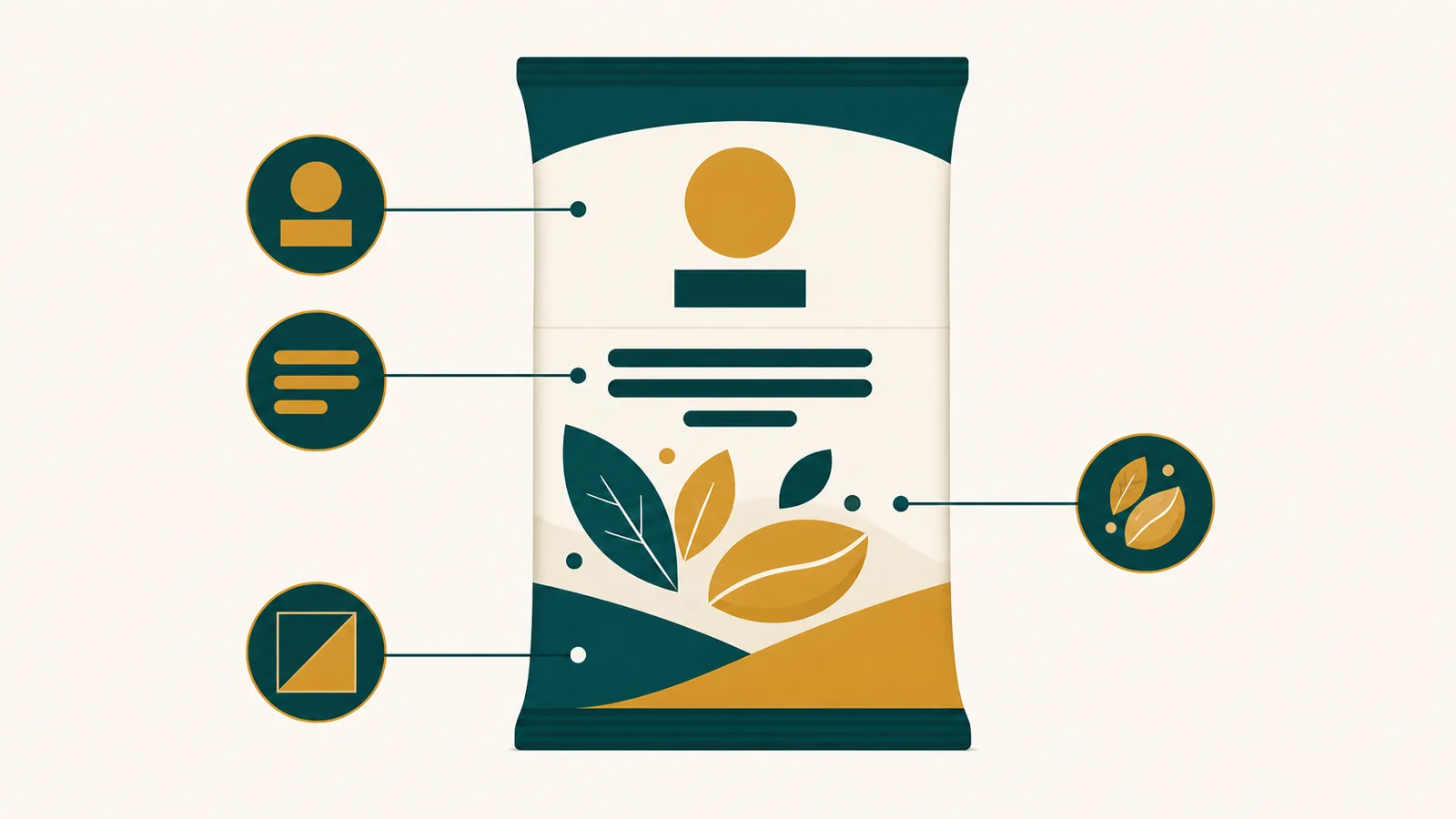
A workable hierarchy for a bilingual Arabic-English pack front usually follows a consistent order, adapted to category and brand:
- Brand identity and logo, positioned so it reads instantly in whichever script the shopper's eye lands on first
- Product name in both languages, sized so neither feels like an afterthought
- One clear flavour, variant or format cue, ideally carried through colour rather than text alone
- Net weight or count, in a fixed, predictable spot shoppers learn to scan for across a range
- Any mandatory regulatory text, kept separate from the shelf-facing hierarchy so it does not compete for attention
That last point matters more than it might seem. Mandatory Arabic labelling requirements exist to inform the shopper, not to sell the product, and a design that tries to make regulatory copy do double duty as a selling element usually ends up cluttered on both counts.
What earns shelf standout with GCC shoppers
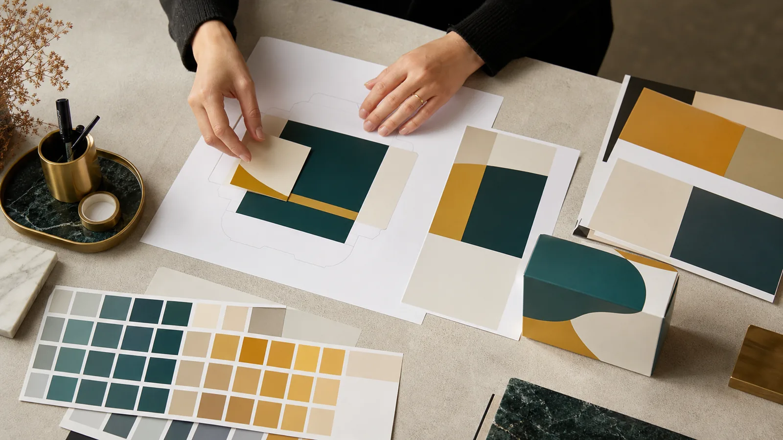
Colour is the fastest signal a shopper processes, faster than any word in either script. The shelf standout that GCC retail rewards is built mainly through colour blocking, long before a shopper reads a single letter. A pack that commits to one strong, saturated colour block per variant, rather than a busy multi-colour front, reads from further away and is easier for a shopper's eye to relocate on a repeat purchase.
Block colour beats gradient clutter
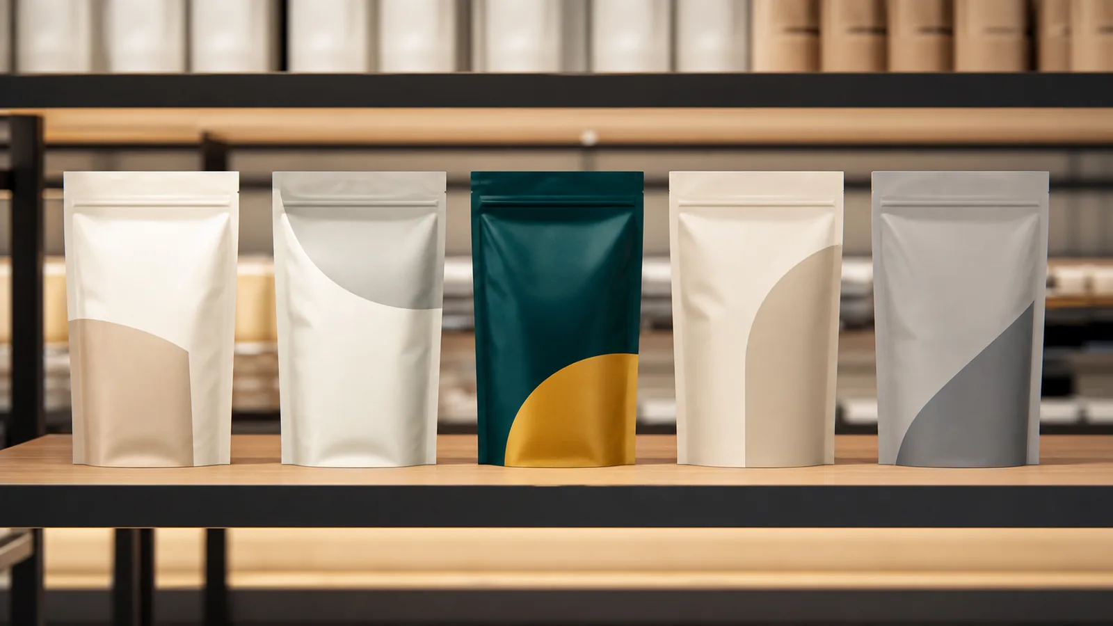
We see this pattern repeatedly across categories we distribute. Brands that assign one dominant colour per SKU variant, a deep red for one flavour, a warm gold for another, build what amounts to a colour code shoppers learn without realising it. A returning shopper who liked the red one does not need to reread the name. They scan for the colour. Packs built instead around photographic backgrounds, soft gradients or busy pattern fills tend to blur together at a glance, even when the individual design is attractive up close.
This does not mean every pack should look like a flat colour swatch. It means the dominant colour block, wherever it sits on the pack, should be large, confident and consistent across the range so shoppers can build a mental map of the brand's shelf footprint over repeat visits.
Contrast against the shelf, not just against itself
A design that looks balanced on a white studio background can vanish once it sits between two other packs on a real shelf. Before finalising any pack design, it is worth mocking it up next to its real competitive set, the products it will sit beside on a UAE shelf, rather than judging it in isolation. A pastel pack that looks refined alone can read as washed out next to a shelf full of saturated competitor colours. On the flip side, a genuinely bold colour choice can look almost aggressive on a design board, then read as exactly right once it sits where it has to compete.
Consistency across a range builds recognition faster than novelty
Brands that redesign packaging frequently, chasing trend cycles, often lose the shelf recognition they had already built. A shopper who has bought a product for a year develops a kind of muscle memory for its shape and colour block on the shelf. Change that block colour system without a strong reason and you are asking the shopper to relearn a habit, at exactly the moment a competitor is happy to be recognised instantly in their place.
Legibility at arm's length: the test most packs fail quietly
Legibility is not the same question as good typography. A typeface can be elegant, on-brand and beautifully kerned, and still fail the basic job of being read correctly by a shopper glancing at it from a shelf while pushing a trolley one-handed. Pack design for UAE retail has to treat legibility as a functional requirement, tested under real conditions, not a stylistic preference decided in a design review under studio lighting.
Lighting conditions inside a real UAE store
Store lighting varies more than brand teams often account for. A hypermarket's bright, even overhead lighting reads packs differently than a smaller grocery's dimmer, warmer-toned fixtures, and both differ again from a baqala's basic fluorescent tube lighting. A pale gold foil detail that looks premium under a photographer's studio lights can go nearly invisible under a baqala's flicker. Testing a pack proof under a few different real lighting conditions, not just the studio shot used for the packaging deck, catches this before it becomes a print run problem.
Font choices that hold up in both scripts
Some typefaces have well-matched Arabic and Latin companion fonts built for exactly this kind of bilingual use. Others are paired together after the fact by a designer working quickly, and the mismatch shows in stroke weight, letter spacing or overall visual rhythm. When a pack uses a proper matched type family across both scripts, the two languages feel like one coherent design rather than two separate jobs glued together. Shoppers may never consciously notice this, but it affects how quickly and comfortably they read the pack, which is the whole point.
A short, practical legibility checklist
- Print a real proof at actual pack size, not a scaled-up digital mockup
- Hold it at arm's length under normal room lighting and time how fast the brand and product name register
- Check the same proof under warmer, dimmer lighting to catch foil or pale-colour legibility problems
- Ask someone who reads Arabic first and someone who reads English first to each identify the product in under two seconds
- Photograph the pack sitting among its real shelf competitors, not alone, before signing off
That fourth step catches more real problems than any single-language internal review ever will, because it tests the pack the way it will be read on the floor.
Culturally-tuned imagery for a shopper base that is not one audience
A UAE grocery shopper base is not one demographic wearing different names. It includes South Asian, Arab, Filipino, Western and East African households, often shopping in the same store within the same hour, and increasingly buying for mixed-nationality households through intermarriage and shared kitchens. Imagery that speaks confidently to only one of those groups risks reading as generic, or worse, mildly foreign, to the others.
Food photography that reads across cultures
The safest and most effective imagery choices we see working across this shopper base tend to focus on the food itself, prepared plainly and shown close, rather than leaning heavily on a specific serving context, table setting or family scene that signals one culture more than another. A close, appetising shot of the actual product, texture and colour rendered accurately, tends to perform consistently across shopper groups because it sells the food rather than a lifestyle attached to one background.
Where lifestyle imagery is used, it is worth checking who appears in it and how. A serving scene, table setting or occasion cue that reads as warmly familiar to one nationality can read as slightly foreign, or just neutral and unmemorable, to another. That is not a reason to avoid lifestyle imagery altogether. It is a reason to test it against more than one cultural lens before locking the design.
Colour and symbol meanings are not universal
Colours and symbols carry different associations across the cultures shopping the same shelf. A colour choice that reads as celebratory in one cultural context can read as neutral, or occasionally as inappropriate for a food category, in another. This is not a call for bland, safe design. It is a case for checking meaning deliberately rather than assuming a colour choice that worked in one brand's home market will translate cleanly here.
Where restraint outperforms cleverness
A pattern we have watched repeat across categories: the imagery choices that perform best across this multi-nationality shopper base are usually the more restrained ones. A clean, honest photograph of the product, strong colour blocking, and a confident bilingual hierarchy tend to outsell a cleverer creative concept built around one cultural reference point that only part of the shopper base recognises. Clever can work brilliantly in a single-market campaign built for one audience. On a shared GCC shelf, clarity usually wins.
How pack design supports on-shelf conversion
On-shelf conversion is the point where design stops being a creative exercise and starts being a sales number. A pack can look striking in a portfolio review and still underperform on the shelf if it does not solve the specific decision problem a shopper is working through in front of it. Understanding what that decision problem is, category by category, is what separates design that looks good from design that sells.
The decision behind the choice
In a crowded category, a shopper is rarely choosing between "buy this or buy nothing." They are choosing between five or six broadly similar options in roughly the same price band. The pack's job is to answer, in under two seconds, the one or two questions that decide that choice: is this the flavour or variant I want, is this a size that fits what I need today, and does this look like something I already trust or would be curious to try. A pack that spends its visual hierarchy on anything other than those questions is spending it on the wrong thing.
Where our merchandisers see conversion happen
Our field teams walk thousands of store visits across modern trade and traditional trade every month, and the pattern they report back is consistent. Packs that convert well almost always let a shopper identify variant and size from the aisle-end, before they are even standing directly in front of the shelf. Packs that underperform tend to need the shopper standing close, turning the pack over, before the key decision information becomes clear. By that point, a competitor pack has usually already answered the same question faster.
Design and merchandising have to work together
Even a well-designed pack can underperform if it is not merchandised in a way that lets its design do its job. A pack built around a strong colour block loses most of that advantage if it gets placed in a shelf position where the colour is obscured by a shelf-edge label strip, a promotional wobbler, or poor eye-level placement. This is one reason distribution and marketing genuinely need to talk to each other before a launch, not after a slow sell-through report arrives. A pack designed without any merchandising input, then handed to a distribution team to place wherever space allows, rarely performs the way the design brief intended.
Testing design decisions before a full print run
Before committing to a full production run, it is worth placing pack mockups on an actual shelf, or a close simulation of one, alongside the real competitive set, and watching how quickly people find them. A small in-store test in a handful of outlets can surface problems, a colour that reads differently under store lighting, a hierarchy that takes too long to parse, before they are locked into thousands of units. This step gets skipped more often than it should, usually under launch-date pressure, and it is almost always the step brand teams wish they had not skipped once sell-through numbers come in soft.
Common pack design mistakes we see repeated across brands
A few mistakes show up again and again across the packs our teams handle, regardless of category or brand size. None of them are exotic. Most come from treating pack design as a task finished once it looks good in a design file, rather than one tested against how it will be read on a real shelf.
Treating Arabic as an addition rather than a partner
The clearest tell is an Arabic sticker or panel that looks visually separate from the rest of the pack, a different font family, a slightly different colour treatment, sitting awkwardly in whatever space was left over after the English layout was finished. Shoppers notice this even if they cannot articulate why the pack feels slightly off. Building Arabic into the layout from the first draft, rather than translating and inserting it afterward, solves this at the source.
Over-cluttering the front panel
Every additional claim, badge, banner or callout added to a pack front competes with every other element for the same one or two seconds of shopper attention. A front panel trying to communicate eight things at once usually ends up communicating none of them well. The strongest packs we see tend to say one thing loudly rather than several things quietly.
Designing for the studio shot, not the shelf
A pack rendered beautifully against a clean white studio background can look entirely different once it sits in a real shelf set, under real lighting, next to real competitors. Design reviews conducted entirely in isolation, without a shelf mockup, are one of the most common reasons a pack that looked strong internally underperforms once it reaches a UAE store.
Ignoring how the pack photographs for e-commerce
With grocery e-commerce and quick commerce now a meaningful part of how UAE shoppers buy, from Amazon.ae to Noon to Talabat's grocery listings, a pack also needs to hold up as a small thumbnail image on a phone screen, often shown at a fraction of its physical size. A design that depends on fine detail or subtle colour variation to communicate can lose that entirely once it is compressed into a small product tile. Testing a pack design as a small digital thumbnail, alongside the physical shelf test, is worth building into the process rather than treating as an afterthought.
Bringing design, distribution and shelf reality together
The brands that consistently get pack design right in this market are the ones that stop treating design, compliance and merchandising as three separate conversations handled by three separate teams at three separate points in a launch timeline. A pack designed without input from the people who will place it on shelves, and without an honest look at the real competitive set it will sit beside, is designed for a market that does not exist.
This is also where working with a distributor who sees the shelf directly, rather than only reviewing sell-through reports after the fact, makes a real difference. Our merchandising and marketing teams walk the same aisles every week, and that direct view of how a pack performs against its real neighbours is something a spreadsheet cannot fully capture. If you want to talk through how a specific pack design would read on a UAE shelf before you commit to a print run, our team is happy to walk through it with you.
Key takeaways
- Food packaging design that GCC shoppers respond to has to win a one-to-two-second glance across a dense, highly varied shelf set, not just look good in a design review.
- A bilingual Arabic-English pack works best when both scripts are designed together from the first draft, with a clear lead script and matched type weight, not translated and inserted afterward.
- The shelf standout that GCC retail rewards comes mainly from confident, consistent block colour per variant, tested against the real competitive set rather than judged in isolation.
- Legibility should be tested at arm's length, under real and varied store lighting, not only under studio conditions.
- Imagery for a multi-nationality shopper base tends to perform best when it is honest and food-focused rather than built around one culturally specific lifestyle scene.
- Design only supports on-shelf conversion when it is tested with real merchandising placement in mind, including how the pack reads as a small e-commerce thumbnail.
Good pack design in this market is less about a single striking idea and more about a series of small, testable decisions: which script leads, how big the colour block is, whether the name reads at arm's length, whether the imagery speaks to more than one shopper at once. Get those right and the pack does a meaningful share of the selling before a shopper has consciously decided anything. Browse more of our thinking on this topic on the Bagason blog, or start from the Bagason homepage to see how our marketing and distribution teams work together on shelf performance.
Frequently asked questions
What makes food packaging design different in the GCC compared with a single-language market?
A GCC shelf is read by shoppers scanning in Arabic, English, or mostly by colour and shape alone, often in the same aisle at the same time. Food packaging design that GCC brands succeed with has to work for all three reading styles at once, rather than assuming one dominant language or cultural reference point the way a single-market design brief often does.
Should Arabic or English lead on a bilingual food pack?
Either can lead, depending on brand positioning, but one script should have clear visual priority so the eye has an entry point. The mistake to avoid is squeezing both scripts into equal, cramped space with no real hierarchy. A bilingual Arabic-English pack designed from the first sketch, rather than translated after the English layout is finished, almost always reads faster in both languages.
How do you make a pack stand out on a crowded UAE shelf?
The shelf standout that GCC retail rewards comes mainly from a strong, consistent block colour per product variant, tested next to the pack's real competitive set rather than judged alone on a studio background. Busy gradients, photographic backgrounds and multiple competing colours tend to blur together at a glance, while one confident colour block reads instantly and builds recognition over repeat visits.
What is the arm's-length legibility test and why does it matter?
It means holding a printed pack proof at the distance a shopper's hand actually reaches on a shelf and checking whether the brand and product name are instantly legible in both scripts, under normal and dimmer store lighting. Many pack designs look fine in a studio review yet fail this simple test, which is a strong early warning sign before a full print run is committed.
How should imagery be chosen for a multi-nationality shopper base?
Honest, close, food-focused photography tends to perform more consistently across a mixed shopper base than lifestyle imagery built around one specific cultural setting or occasion. Colours and symbols also carry different meanings across cultures, so it is worth checking a design against more than one cultural lens rather than assuming a look that worked in one market will translate directly here.
Does good pack design actually affect sales, or is it mostly cosmetic?
Design supports on-shelf conversion when it helps a shopper answer their real decision, usually variant, size and trust, within a second or two of looking at the shelf. Packs that need to be picked up and turned over before that information is clear tend to lose out to a competitor pack that answers the same question faster from a distance.